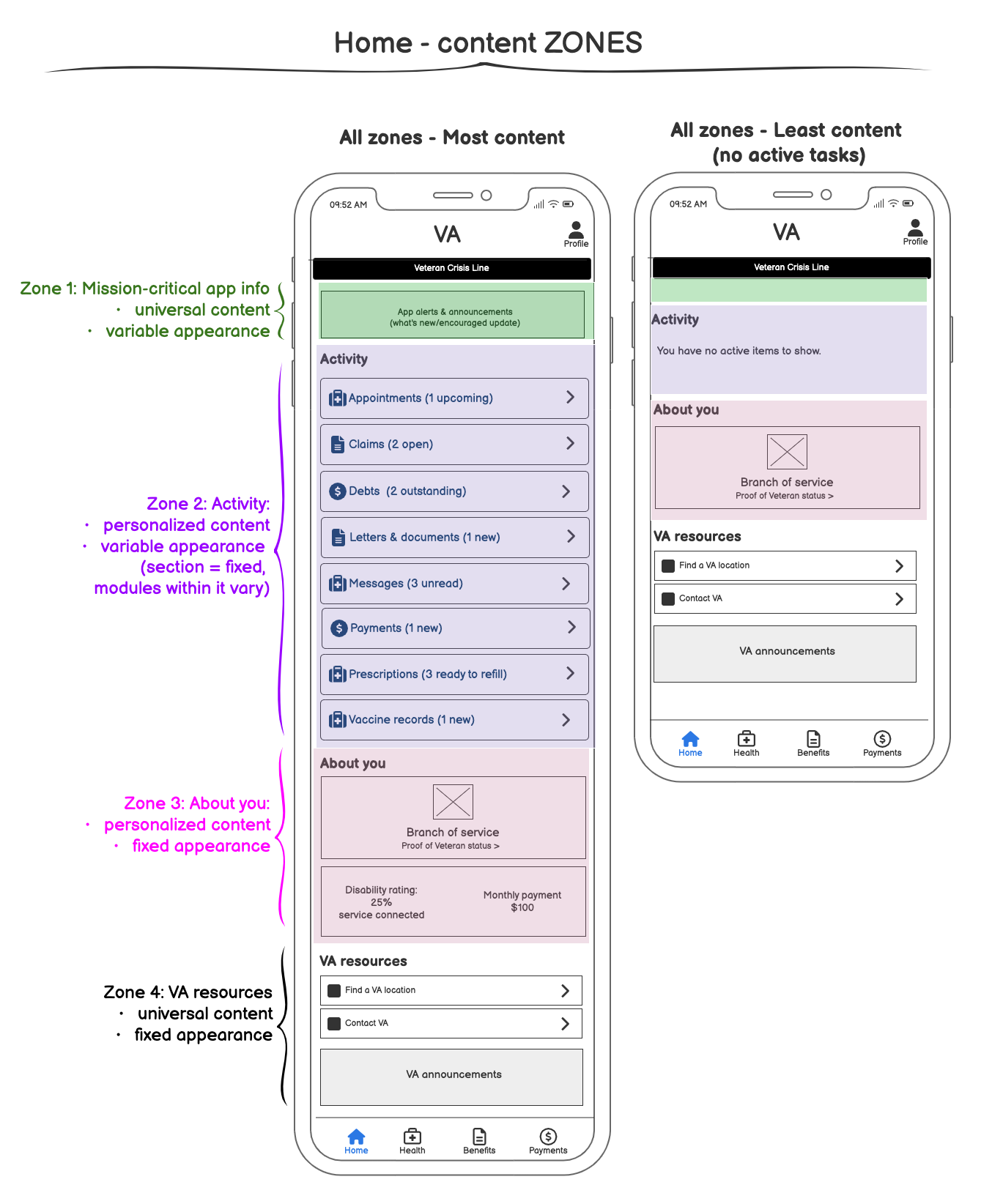
Home Screen
The Home screen is the initial/default screen of the VA Health & Benefits mobile app. It sits at the top level of the hierarchical navigation (as a peer to the Health, Benefits and Payments category screens) and displays a personalized summary of a Veteran's current tasks and interactions with features in the VA mobile app. It also contains the primary entry point for the Veteran's Profile information (including App Settings).
Anatomy:
The VA mobile app’s personalized home screen combines content that is variable, fixed, personalized, and evergreen to deliver an experience that surfaces value to Veterans and supports understanding of the app’s capabilities, regardless of what a Veteran’s interactions are with the VA. To do this in a way that's predictable and performant, the Home screen displays a mix of content types within predetermined locations (zones).
Having a mix of content, arranged into intentional zones, ensures that users:
- Always see elements that help demonstrate the current & future value of the app
- Always see "personalized" information even if they don't have any active tasks at a given moment (users don’t experience an empty home screen in the absence of tasks)
- See the things that are likely relevant and valuable to them first
- Get a consistent information structure for screen readers to tab through that is present even if load times lag
- See things that are important to proper app functioning when necessary
Zones
The VA Mobile app Home screen zones ensure that the most impactful content items are getting the proper placement in the screen's hierarchy while also handling a variety of user contexts and technical situations.

Zone 1: Mission-critical app info
- What it is: Area for alerts and announcements from the app. It informs users when there’s something they need to do to ensure that the app is functioning and informs users of new features
- Module appearance logic: Variable & optional, can be personalized or universal: Modules appear to all users when in applicable situations. Otherwise, do not show.
- What lives in this zone:
- Encouraged update (MVP)
- What’s new (MVP)
- Guidelines for future module inclusion:
Information is appropriate for inclusion on the home screen within the mission-critical app info section when it:
- Conveys information that’s necessary for the app to function properly
- Conveys information about important changes within the app
Zone 2: Activity
- What it is: An alphabetical list of feature modules giving Veterans an overview of what VA is doing for them—includes any critical “in-flight” tasks or actions that may need attention. Each module contains personalized information briefly summarizing that activity and provides a secondary entry point into the app feature.
- Module appearance logic: Variable. Modules appear while that feature’s activity is still considered “in flight” or when there is a user action to take. Each feature has different periods of time/circumstances that determine how long they are visible on the home screen (ex: the Claims module stays until the claim closes, the Secure Message stays until any new messages have been viewed).
- Module anatomy
- Title: Feature name
- Description text: Indicates # of items with an in-flight status; terms used vary by feature; provides just enough information to accurately indicate what is happening/is needed.
- What lives in this zone:
- Prescriptions (MVP)
- Appointments (MVP)
- Messages (MVP)
- Claims (MVP)
- Debts (future)
- Letters & documents (future)
- Payments (future)
- Vaccine/medical records (future)
- Travel pay (future)
- Guidelines for module inclusion:
A feature is appropriate for inclusion as an Activity module on the home screen when it:
- Has an “in-flight” status (ex: an open Claim, an upcoming Appointment)
- Has an action that is available for the user to take (ex: a refillable Prescription, an unread Message)
Zone 3: About you:
- What it is: A personalized, high-level snapshot of the individual Veteran at VA.
- Module appearance logic: Fixed appearance.
- What lives in this zone:
- Branch of Service/Veteran Status card (MVP)
- Disability rating & monthly payment (MVP)
- Guidelines for module inclusion:
Information is appropriate for inclusion on the home screen within About you when it:
- Is or provides access to information relating to who the individual Veterans is within VA as opposed to relating to a specific activity or task
- Contains high-level data about the individual Veteran that changes infrequently
Zone 4: VA resources:
- What it is: Links to support/tools that are of universal interest to Veterans and a space for announcements from VA.
- Module appearance logic: Fixed appearance
- What lives in this zone:
- Contact us (MVP)
- Find a VA Location (MVP)
- Banner space for VA announcements (MVP)
- Banner appearance is optional—use when needed.
- Display one banner at a time.
- Banner announcements should be of interest to all Veterans, and timely.
- Guidelines for module inclusion:
Information is appropriate for inclusion on the home screen within the VA resources section when it:
- Is a tool or information that is relevant to a general audience, and
- It does not fit within the Benefits, Health or Payment categories.
Screen Template
The Home screen uses the Category screen template.
Resources
- Figma file: Home screen 2.0 Shipped File (includes happy path as well as design for loading states, errors, and alternate statuses)
- Mural: Home screen 2.0 Appearance logic for error handling and edge cases
Design Principles
TBD (discussion of the role of surface and elevation in the home screen’s design)